
Personalize WhatsApp carousel message template
Configure a WhatsApp Carousel Message Template with multiple horizontally scrollable cards, each with its own media, text, and buttons. For teams presenting products, services, or promotions in one contact interaction.
After you complete the Metadata step and select Carousel as the Message Template Type, configure the content of your WhatsApp Carousel Message Template.
A carousel template displays multiple horizontally scrollable cards in one message. Each card can contain its own media, text, and interactive buttons, so you can present products, services, promotions, or other content in one customer interaction.
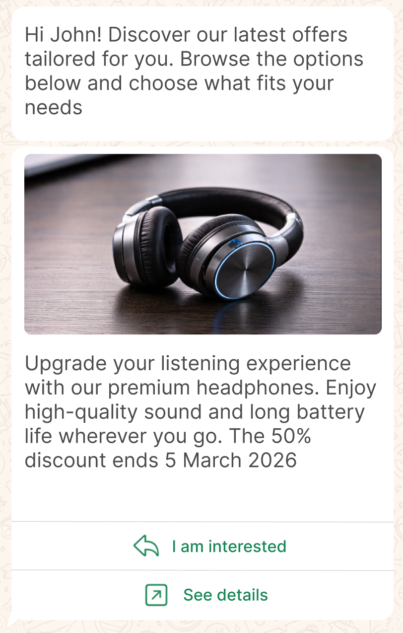
Use cards to help recipients browse options, compare items, or choose an action without leaving the conversation.
NOTEA carousel template supports 2 to 10 cards, and all cards must follow the same structure. For example, if the first card includes a media header, body text, and buttons, every remaining card must also include the same components.
This format is particularly useful when the goal is to present structured content in a compact, interactive way. Typical use cases include:
- Product catalogs or featured items
- Promotional events with multiple offers
- Step-based navigation or guided experiences
- Content discovery (articles, services, categories)
Carousel message template components
A WhatsApp Carousel message template includes a body and a set of media cards displayed in a single horizontally scrollable message.
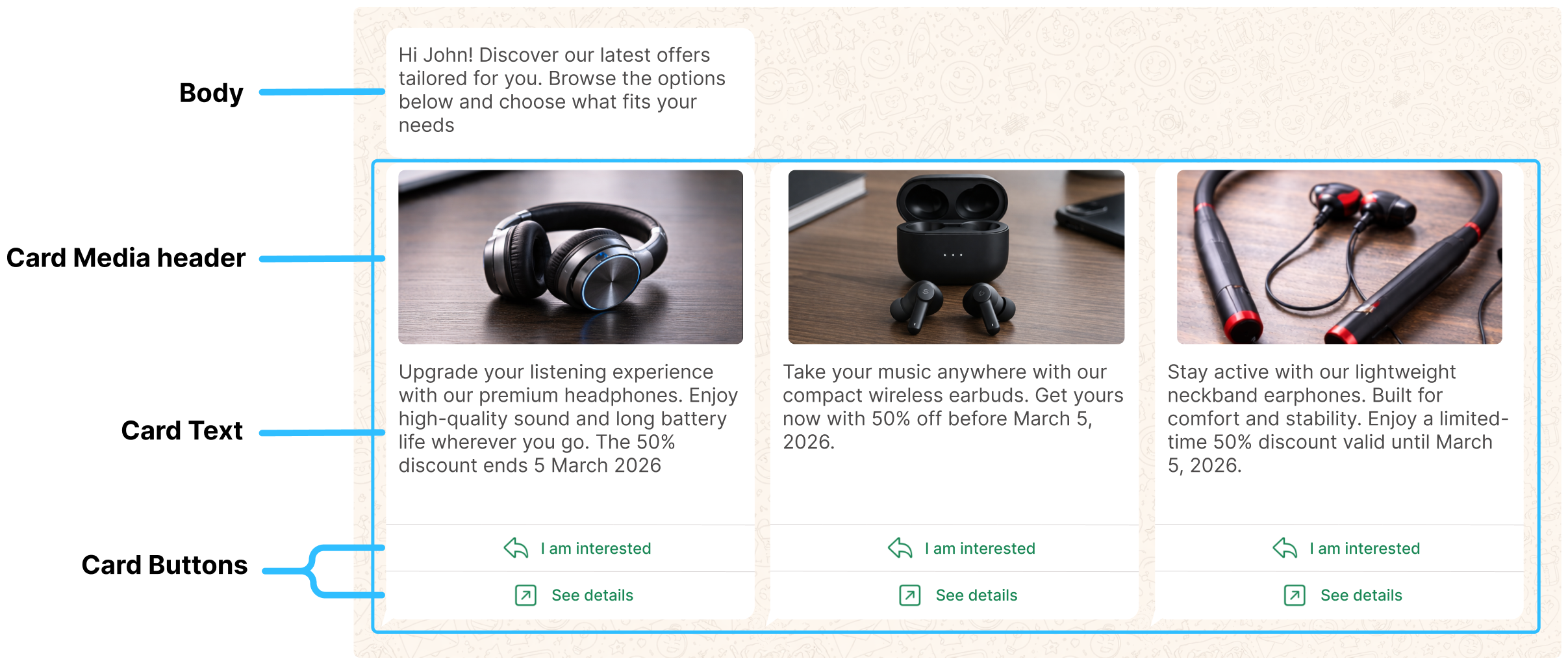
The carousel is defined as a collection of cards:
- Minimum: 2 cards
- Maximum: 10 cards
Cards that appear first receive more visibility, so order them intentionally.
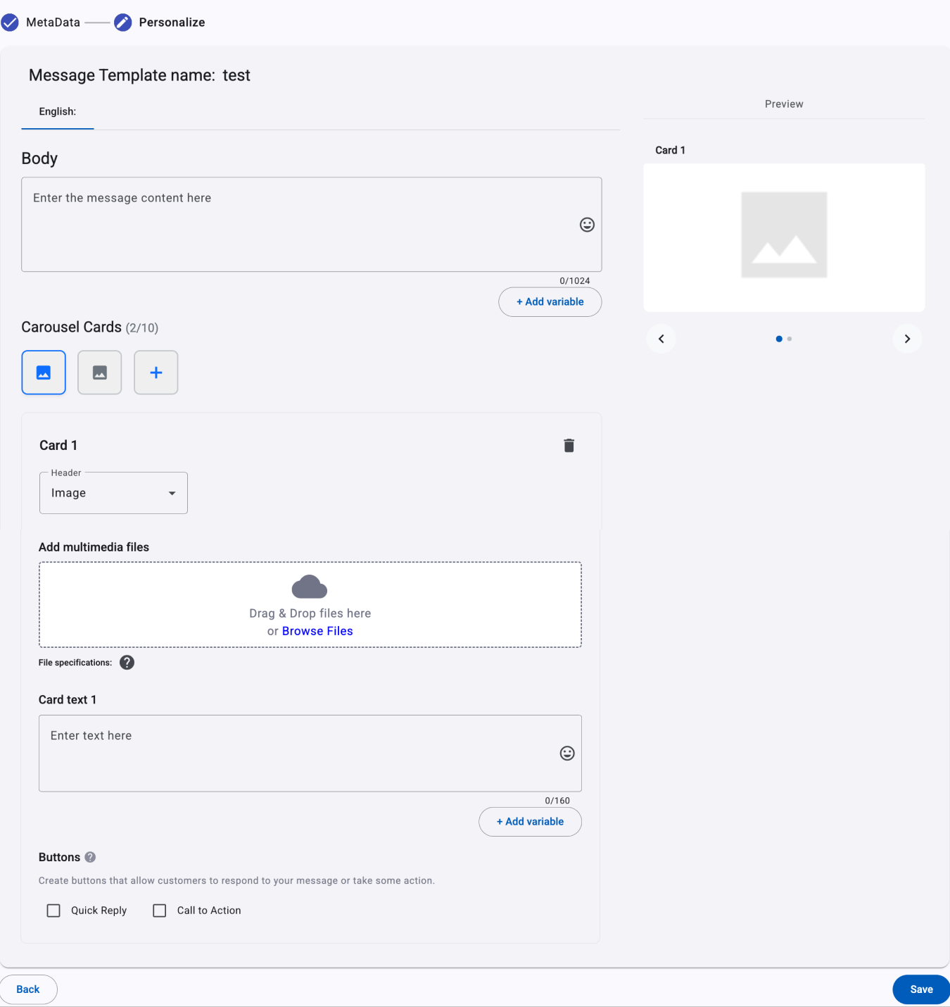
The following sections describe each component in the order it appears in the interface.
Body
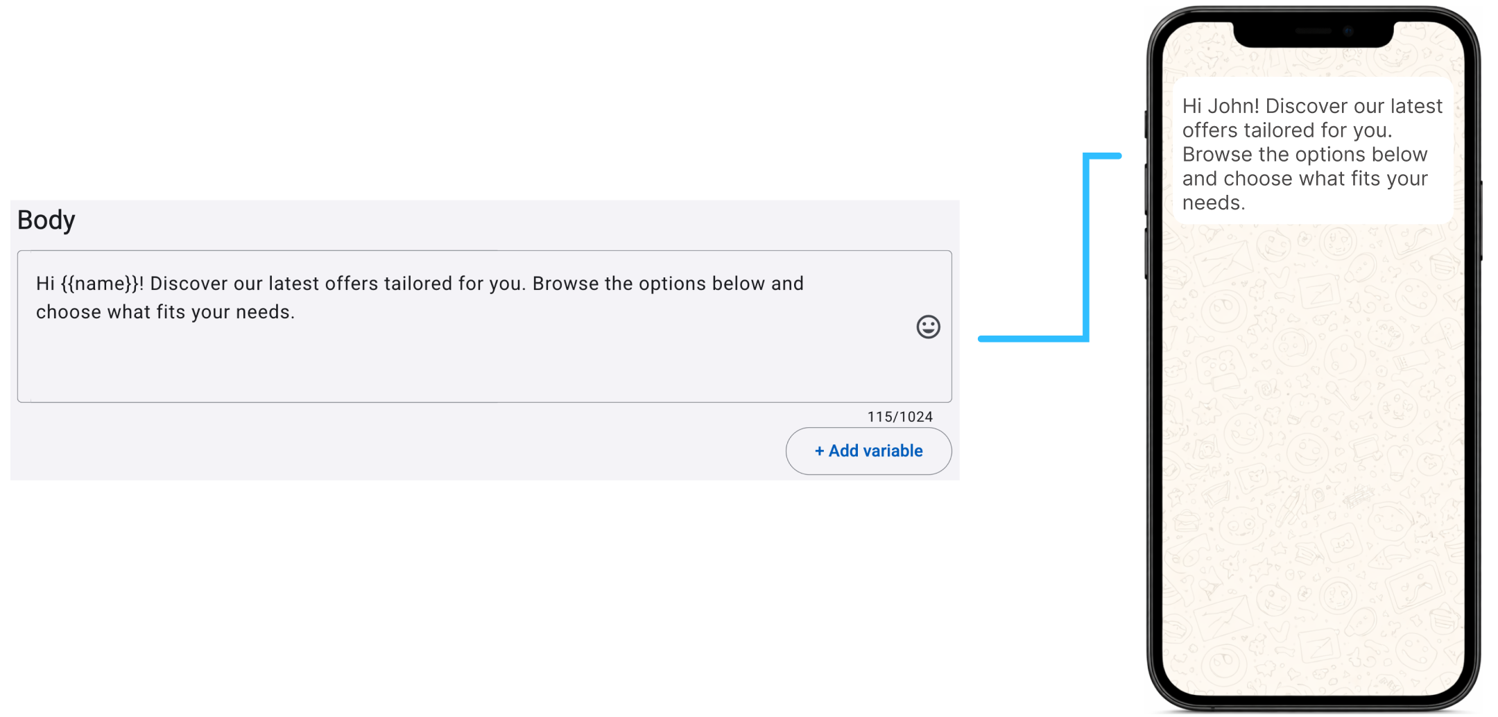
The Body is defined once and appears above the carousel, providing context or introducing the content that follows. This text applies to the entire message and can include variables (placeholders).
The following example shows how the Body is configured in the platform and how it appears in the WhatsApp message preview presented to the recipient.
ON MESSAGE VARIABLESVariables to be added to the message body, are platform defined fields and those that you have defined and added to the platform.
To know how to add variables (placeholders) to the body, go to the Adding Variables section.
Review the fields section of the platform here.
Carousel Cards
Use the Carousel Cards section to create and manage the cards in your template. Each card can include a Media Header, Text, and Buttons.
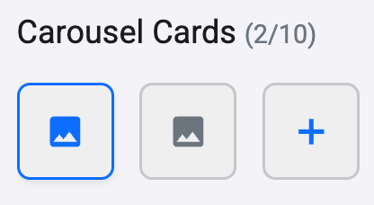
A carousel must contain 2 to 10 cards. Use the card selector at the top of the section to select a card and edit its content; the selected card is highlighted.
To add a card, select the + icon. Configure each new card independently while maintaining the required shared structure.
Card media header
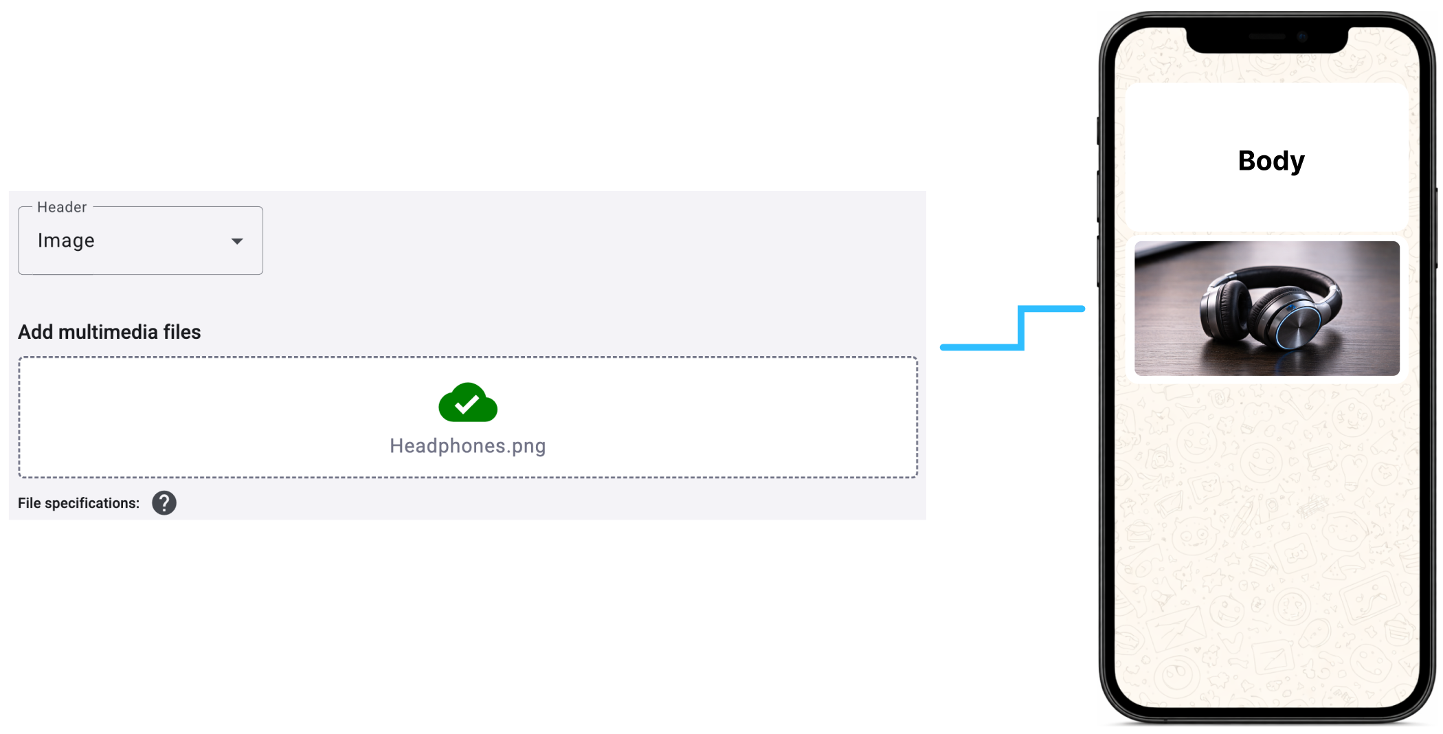
Every card requires a Media Header, which appears first and provides the card's primary visual context.
Add one media asset—an image or video—to the top of each card.
The following example shows how the Card Media Header (image) is configured in the platform and how it appears in the WhatsApp message preview presented to the recipient.
Use the following supported formats and file-size limits for Media Headers:
| File type | Supported formats | Maximum file size |
|---|---|---|
| Image | .jpeg, .jpg, .png | 5 MB |
| Video | .mp4 | 16 MB |
Note:
- Images must be 8-bit, RGB or RGBA.
- Video files must use the H.264 video codec.
WARNINGThe card media headers must be consistent across all cards (same type and similar dimensions)
Card Text
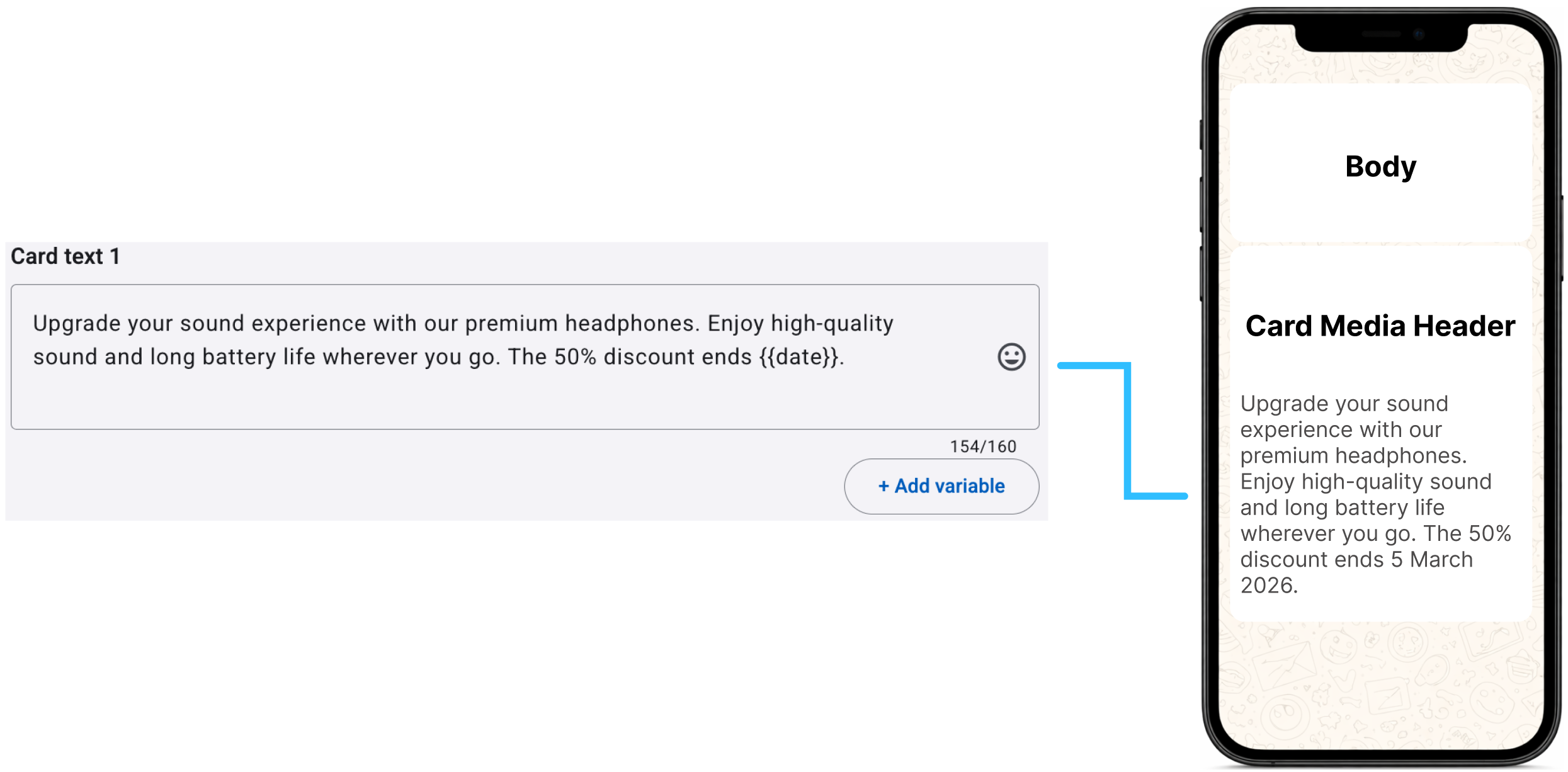
Below the Media Header, each card can include optional Text to describe its content, such as product details or key features. Text can include variables (placeholders). If one card includes Text, all cards must include it.
The following example shows how the Card Text is configured in the platform and how it appears in the WhatsApp message preview presented to the recipient.
ON MESSAGE VARIABLESVariables to be added to the card text, are platform defined fields and those that you have defined and added to the platform.
To know how to add variables (placeholders) to the card text, go to the Adding Variables section.
Review the fields section of the platform here.
Card Buttons
Add buttons at the card level to let recipients interact with each card. Supported button types include:

- Quick Reply buttons
- Call to Action - URL buttons (Static & Dynamic)
- Call to Action - Phone number button
Each card can include up to 2 buttons. You can combine button types, but every card must use the same button structure: number of buttons, button types, and button order. For example, if the first card has a Quick Reply button followed by a URL button, every other card must use that arrangement.
Quick Reply buttons
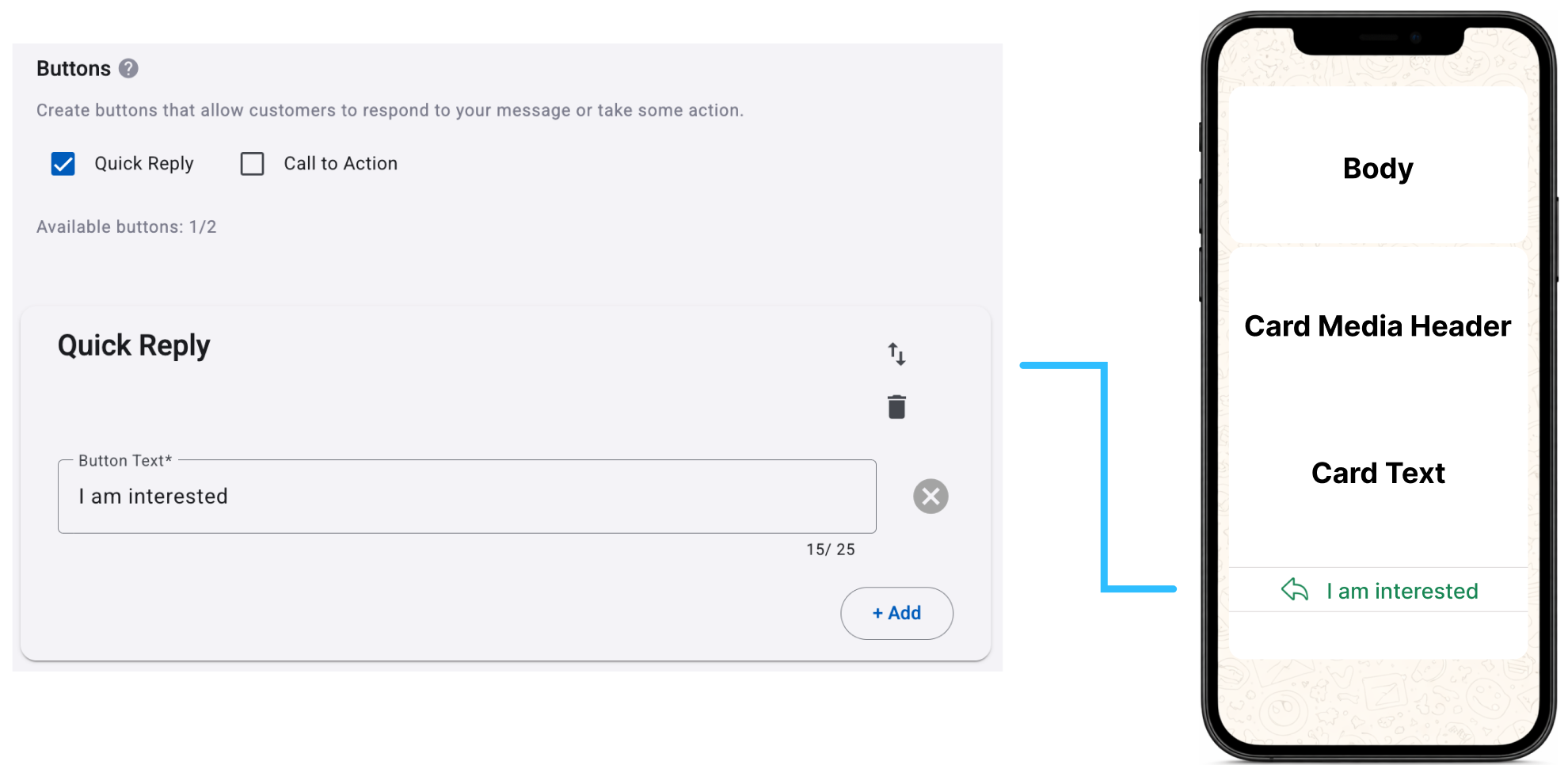
Quick Reply buttons let recipients send a predefined response with one tap. Use them to capture interest, request more information, confirm a preference, or continue a guided interaction in WhatsApp.
Unlike Call to Action buttons, Quick Reply buttons do not send recipients outside WhatsApp. You can configure up to two per card. Each button includes a visible Button Text label and a payload value sent to the platform when the recipient selects it.
Quick Reply buttons can be used in different contexts depending on how the payload is configured:
-
Consent Management actions: The payload can be mapped to predefined system actions such as Auto-Reply, Opt-Out, Help Response, or Join Response. In this case, the button triggers a built-in behavior managed by the platform.
For example, we are going to add two buttons to the message content:
- Button Text = Yes, Button payload: agree
- Button Text = No, Button payload: NotAgree
If the end user selects the button ‘Yes’, the platform receives the payload value ´agree´ and processes it accordingly.
You set the value of the Button payloads to Consent Management (Auto-Reply, Opt-Out, Help Response, Join Response).
-
Custom automations (keyword-based): The payload acts as a keyword that triggers a specific automation, such as a chatbot or conversational flow.
The entered value in the button field must match exactly the keyword defined in the automation. The platform uses this value to trigger the corresponding automation. If the value does not match the configured keyword, the automation will not be activated.
For example,
- Button Text = Chat with us
- Button Text = Sign me up
These two button texts (Chat with us, Sign me up) are keywords that were defined when creating the automations. This action triggers an automated response that directs the user to the corresponding automation. Therefore, once the end user selects one of these options, they will be redirected to the automation that is linked to the quick reply button selected, which contains the keyword to trigger the automation.
The following example shows how the Card Button (Quick Reply) is configured in the platform and how it appears in the WhatsApp message preview presented to the recipient.
Call to Action - URL buttons
URL buttons allow users to open an external link directly from a carousel card with a single tap. Unlike Quick Reply buttons, which keep the interaction inside WhatsApp, URL buttons redirect the user outside the conversation to a web experience, such as a landing page, product detail page, or checkout flow.
Each URL button consists of a visible label (Button Text) and a destination link (URL) that is opened when the user taps the button. Depending on the device and configuration, the link is opened either in the default browser or within an in-app browser.
URL buttons can be configured in two ways:
-
Static URL: A fixed link that is the same for all users. These are typically used for general landing pages, product pages, or promotional content.
Example:
https://example.com/product/123
To configure a Static URL button:- In the Buttons section, select the Call to Action option.
- From the Type of Action list, select Visit Websites.
- In the Button Text field, enter the label that will appear on the button. This text should clearly describe the action the user will perform, such as "Visit Our Website" or "Learn more". The text field allows up to 25 characters.
- From the URL list, select Static.
- In the Website URL field, enter the URL that users will be directed to when they click the button. Ensure that the URL is correct and active (e.g.,
https://elipackage.com). The URL should start withhttp://orhttps://to redirect the user to the website. The text field allows up to 256 characters.WARNINGWhatsApp does not allow direct links to WhatsApp in Call-to-Action buttons.
Call-to-Action buttons can only be used to open external websites. If you need to share a WhatsApp link (for example, a wa.me link), include it directly in the message body instead of using a button.
Example:
❌ Not supported (CTA button) - Using a Call-to-Action button with a direct WhatsApp link:
Button URL:
https://wa.me/XXXXXXXX✅ Supported (message body) - Including the WhatsApp link directly in the message body:
Message text: Chat with us on WhatsApp (
https://wa.me/XXXXXXXX)
The following example shows how the Card Button (Call to Action - Static URL) is configured in the platform and how it appears in the WhatsApp message preview presented to the recipient.
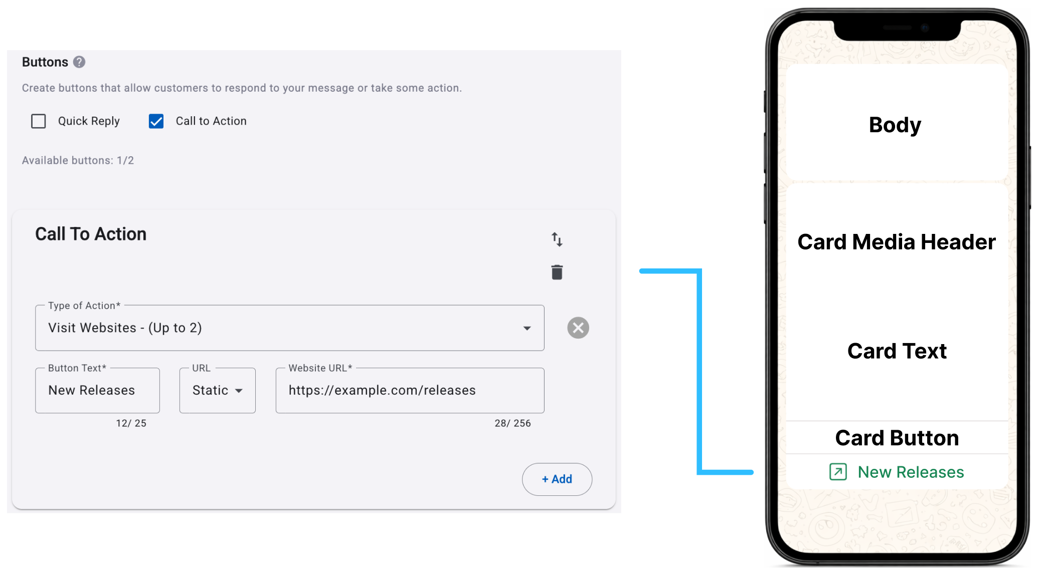
After you've entered all the necessary details for the card button type selected, click the Add button to include an additional card button.
-
Dynamic URL: A link that includes a URL Suffix Value that is replaced at send time. This allows you to personalize the destination.
Example:
https://example.com/{{url_suffix_value}}
To configure a Dynamic URL button:-
In the Buttons section, select the Call to Action option.
-
From the Type of Action list, select Visit Websites.
-
In the Button Text field, enter the label that will appear on the button. This text should clearly describe the action the user will perform, such as "View Your Offer" or "Track Your Order". The text field allows up to 25 characters.
-
From the URL list, select Dynamic.
-
In the Website URL field, enter the base URL where users will be directed. This is the primary website address without the personalized parameters (e.g.,
https://example.com/user). The URL should start withhttp://orhttps://. The text field allows up to 256 characters. -
In the URL Suffix button, select the URL Suffix field to associate a placeholder that represents the dynamic portion of the URL. At send time, the placeholder is replaced with the corresponding value, which is appended to the configured base URL to generate the final destination URL. That is, when the message is sent, the placeholder is replaced with its corresponding value, which is appended to the base URL.
This suffix might include variables (e.g.,?userID=12345or&utm_campaign=sale2024). The actual value of these variables can be customized based on the data you have for each user.
When you select the field, the Add Placeholder dialog opens, where you can either: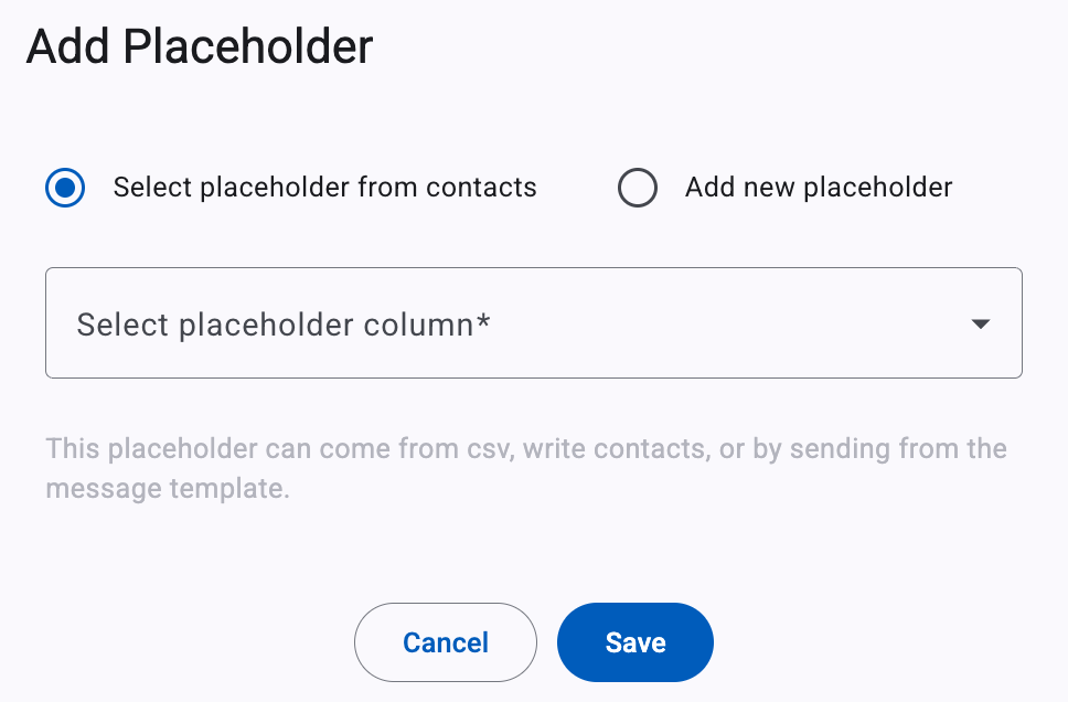
Select placeholder from contacts to use an existing placeholder.Add new placeholder to create a new placeholder.
After selecting or creating the placeholder, select Save to associate it with the URL Suffix field.
The following example shows how the Card Button (Call to Action - Dynamic URL) is configured in the platform and how it appears in the WhatsApp message preview presented to the recipient.
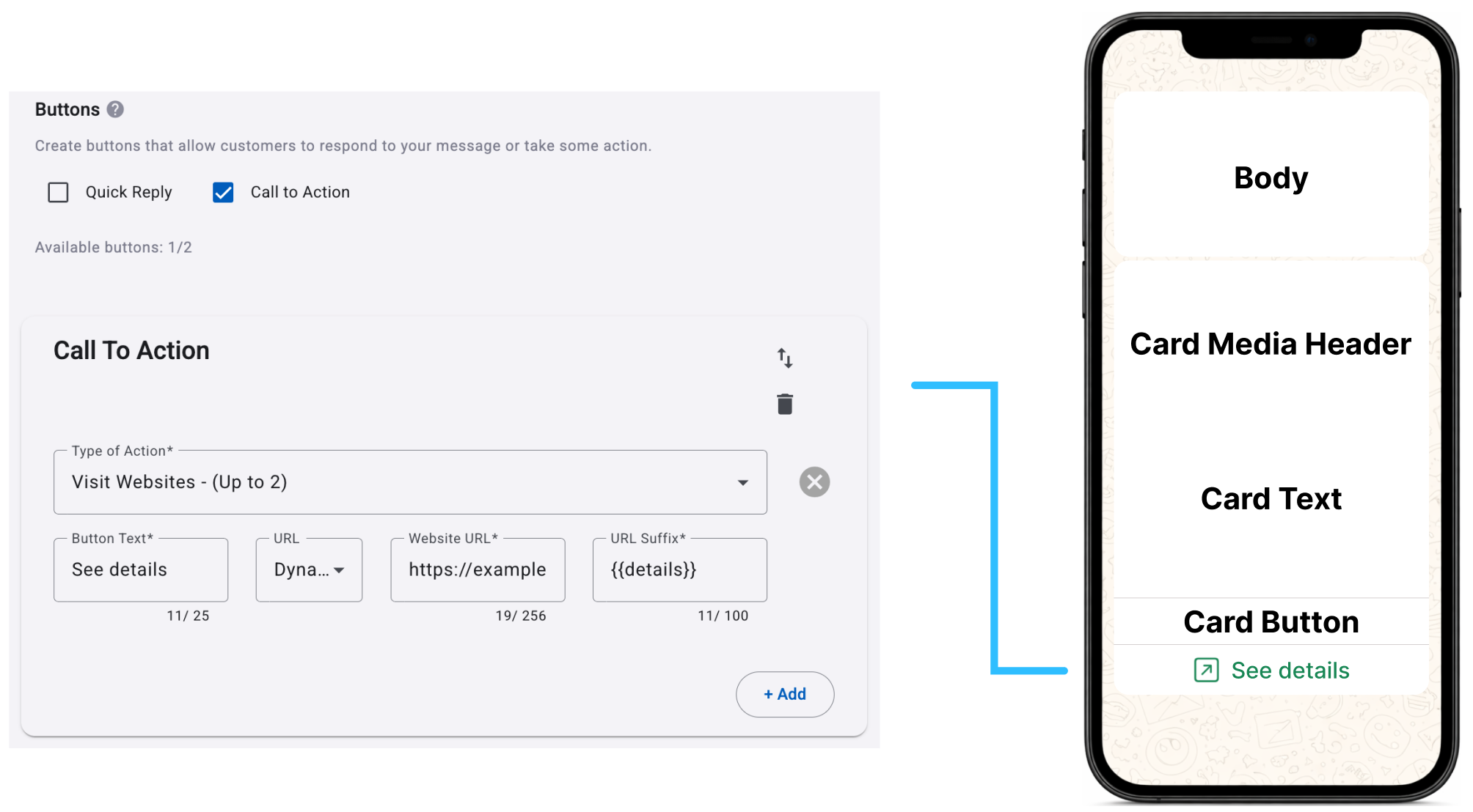
-
After reviewing the static and dynamic URLs configuration, from an implementation perspective, URLs must use HTTPS, be valid and accessible at the time of delivery, and should not redirect to broken or unsupported destinations, as this can negatively impact the user experience. The button text should remain concise and clearly indicate the action, such as “View product”, “Buy now”, or “Learn more”.
As with all carousel components, URL buttons must follow a consistent structure across all cards. If a URL button is included in one card, it must be included in all cards, and its position relative to other buttons must remain the same. For example, if the first button is a URL button and the second is a Quick Reply button in one card, all other cards must follow that same order.
URL buttons can use either static or dynamic links. This does not affect message template validation, as both are considered the same button type. However, the button position and type must remain consistent across all cards.
WARNINGWhatsApp does not allow direct links to WhatsApp in Call-to-Action buttons.
Card Buttons can only be used to open external websites. If you need to share a WhatsApp link (for example, a wa.me link), include it directly in the message body instead of using a button.
Example:
❌ Not supported (CTA button) - Using a card button with a direct WhatsApp link:
Button URL:
https://wa.me/XXXXXXXX✅ Supported (message body) - Including the WhatsApp link directly in the message body:
Message body: Chat with us on WhatsApp (
https://wa.me/XXXXXXXX)
Call to action - phone number button
The Phone Number button allows users to initiate a phone call directly from a carousel card with a single tap. Unlike Quick Reply buttons, which trigger an in-chat response, or URL buttons, which open a web page, this button type enables direct voice communication by launching the device’s native dialer with a predefined phone number.
To configure a Phone number button:
- In the Buttons section, select the Call to Action option.
- From the Type of Action list, select Call to Phone number. The note "(Up to 1)" indicates that only one "Call to Phone Number" button is allowed per card.
- In the Button Text field, enter the text that will appear on the button in the WhatsApp message. This text should be concise and indicate the action, such as "Call Now" or "Contact Us". The text field allows up to 25 characters.
- From the Country/ Region list, select the country code for the phone number.
- In the Phone number field, enter the specific phone number that users will call when they click the card button. Make sure the number is accurate and formatted correctly for the selected country.
The following example shows how the Card Button (Call to Action - Phone number) is configured in the platform and how it appears in the WhatsApp message preview presented to the recipient.
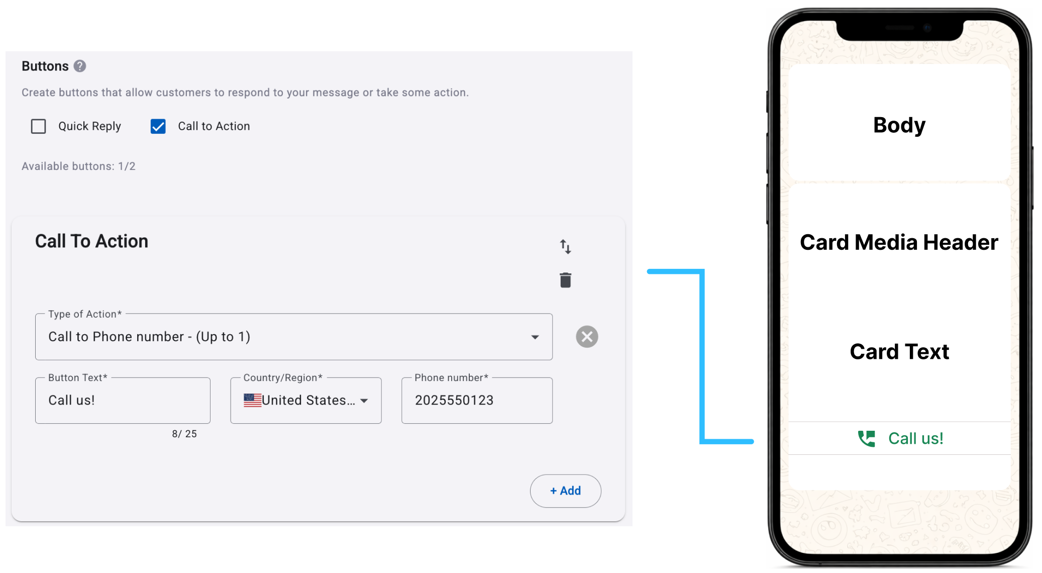
After you configure the WhatsApp Carousel Message Template, select Save to create it. The template must be approved before you can use it to send messages.
WhatsApp can take up to 48 hours to review the template for compliance with its messaging policies and guidelines.
WhatsApp Template StatusOnce the WhatsApp message template has been created, META will assign a quality status to the WhatsApp message template, to know more about these status we recommend you go to the WhatsApp Message Template Quality Status section.
Click Tracking (buttons)
If your template includes at least one URL-based Call-to-Action card button, enable Click Tracking to measure recipient clicks on each button.
After you add at least one of these buttons, the Click Tracking toggle appears at the top of the message template preview.
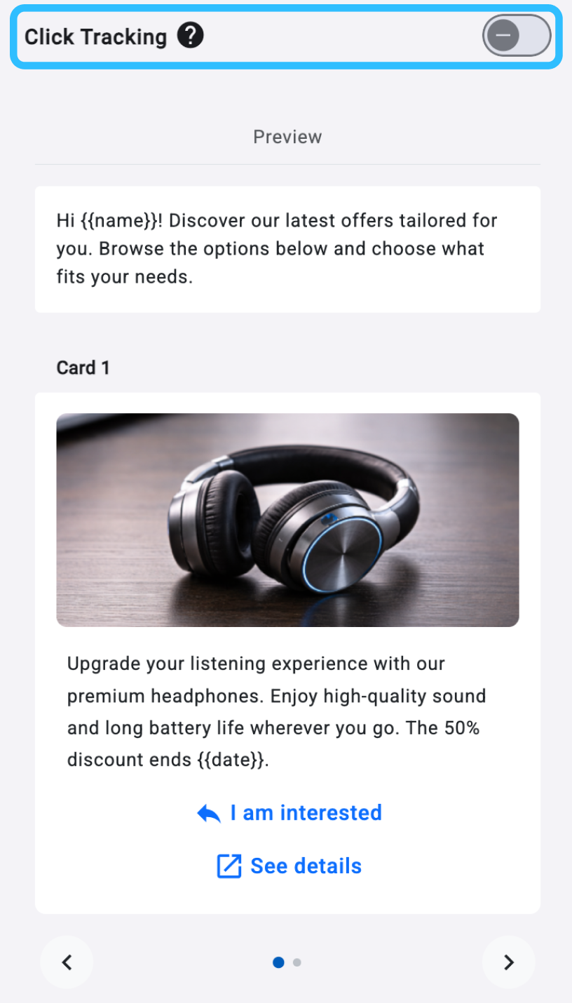
Enable Click Tracking individually for each message template to capture button-level interactions in Reporting & Analytics.
In the Personalize section of the message template editor, switch the Click Tracking toggle in the top-right corner to On. A confirmation pop-up appears:
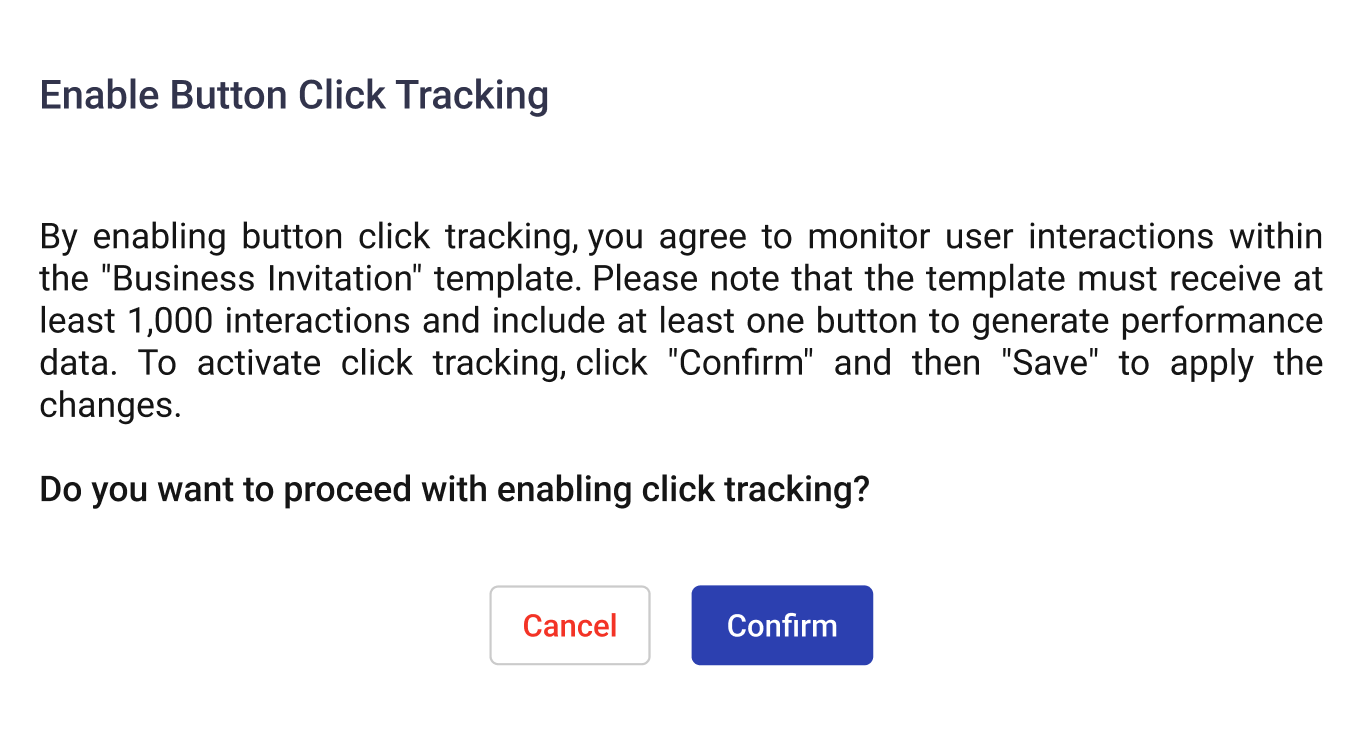
NOTEThe message template must receive at least 1000 interactions and include at least one button to generate performance data.
- Select Confirm to enable Click Tracking.
- Select Save in the bottom-right corner to apply your changes.
After you enable Click Tracking, monitor button-click performance in WhatsApp Message Template Analytics.
After your carousel message template is approved, see Testing and editing a media message template to send a test message.
Updated about 1 month ago
What’s Next
Related pages