Member Card
Use Member Cards to digitize long-term wallet items and store digital membership cards in mobile wallets. These cards contain membership details, discounts, and real-time updates for your customers.
You create, distribute, and manage digital membership cards using custom designs or built-in message templates.
To create a Member Card automation, you complete the following steps:

- Delivery
- Design
- Content
- Interactions
- Message
- Summary
Delivery
You define the Delivery Channel and the Recipients in the Delivery step.
Currently, two delivery channels are available for the Member Card automation:
For more information on selecting the desired delivery channel, go to the Delivery section.
For information on selecting the desired Recipients, go to Define Recipients in the Messaging Elements section.
.
Design
In this step, you customize the message template by choosing your brand's colors and fonts and adding your logo, icon, and a Strip image.
You customize the appearance of the member card using:
- A pre-existing message template (via Open Message Template Gallery) for a faster setup.
- Manual customization by defining individual components.
Selecting Message Template
You set up the message template beforehand when using the message template approach. You use message templates to simplify the automation creation process without building a member card from scratch.
You view message templates by selecting Open Template Gallery on the top right corner, above the preview window.

You see a pop-up window showing message templates that have already been created and stored in the platform.

You select and confirm a message template aligned with your automation.
The platform automatically populates all relevant sections of the Design window with the message template's contents. You then verify that the contents align with your automation's purposes by reviewing and adapting each element.

You select Next after you verify the design setup.
Step-by-step configuration
You build the member card design from scratch. Note that this card is not saved as a message template and is not available for future automations.
The overall design has three main components:
- Pass Design: Upload images for Logo, Notification Icon, Strip Image, and Hero Image (optional).
- Colors: Set background, label, and value colors.
- Barcode: Select a barcode format (QR, Aztec, PDF-417, or Code128) or disable it.
Pass Design
You customize the visual appearance of the member card by uploading images that represent your brand. You add up to four different images, each with a specific function:

| Image | Details |
|---|---|
| Logo | In iOS, the logo image is displayed in the top left corner of the pass, next to the logo text. Dimensions: 480 pixels wide x 150 pixels high. In Android, it is displayed in the top middle of the pass. Dimensions: The minimum size of the logo on the Google Pay pass is 660 x 660 pixels. |
| Notification icon | The icon image is shown when a notification is received from the Wallet Pass in the user's lock screen. Dimensions: 87 pixels wide x 87 pixels high. |
| Strip Image | The strip image is displayed beneath the logo. Dimensions: 1125 pixels wide by 432 pixels high. |
| Hero | The hero image is used only on Google Pay passes. Dimensions: 1032 pixels wide by 336 pixels high. |
You select the Generate Google Pay Pass toggle to enable Google Pay Pass.

If you do not want to generate Android member cards, you disable the toggle. Hero Image for Android is not available, and the Android tab in Mobile Member Card Composer disappears.
If you want to display a strip image below the logo, you toggle the Strip Image option on.

NOTEIf you don't add the Hero Image into the Member Card, the Strip Image is added by default.
Colors
You define the visual theme of your member card by setting colors for different elements. You use a color picker to match your brand's theme.

Barcode
You use the Barcode step to enable automatic barcode generation, allowing end users to redeem their member cards by scanning a machine-readable code. When a user scans the barcode with a mobile device's code reader, they are redirected to promotional information designated by the automation creator.

When you select the Barcode Type dropdown menu, you see four options available for the member card:

QR

Aztec

PDF-417

Code128
If you select 'none' in the dropdown, the member card does not include a barcode.
You use the Mobile Wallet Pass Composer to view the Wallet Pass content according to the device's operating system, including notifications, by selecting the iOS, Android, and Notification tab. You see how your users receive notifications and Member Cards.

You see two sides in the Mobile Wallet Pass Composer:
-
Front of the Pass: You see the front side of the Member Card.
-
Back of the Pass: You see the backside of the Member Card.
When you select the Back of the Pass button on the iOS device, you see the following options:
Automatic Updates: The user decides whether to receive updates on the Member Card.
Allow Notifications: The user decides whether to receive notifications of the Member Card.
Suggest on Lock Screen: The user decides whether to turn on or off suggestions on the lock screen to show the pass based on time or location.
Remove Pass: The user decides whether to delete the Member Card.
NOTEEnd users only interact with the options shown on the backside of the member card.
On Android, the Member Card Details are displayed as a long strip.
Content step
The Content step defines the membership details displayed on the digital card. You add text fields such as the membership ID and benefits, ensuring each card is tailored to the user.
You specify the Content Fields of the Membership Card to continue with the Design Content Configuration of the Wallet Pass:

Content Fields: Set specific fields for the Membership Card Message Template that remain the same throughout the experience for a given user.
These are the steps to configure the Member Card from top to bottom in the main pane:
- Issuer Name: Enter the name of the organization that is offering promotions, special offers, or other discounts. Identify the message template in the grid of the Message Templates section, which appears in the lock screen notification and on the top of the Google Pay Pass.
- Program Name: Enter the Title of the membership program you are creating.
Additional sections allow further customization: Header, Main Fields, Backside Fields, Locations.
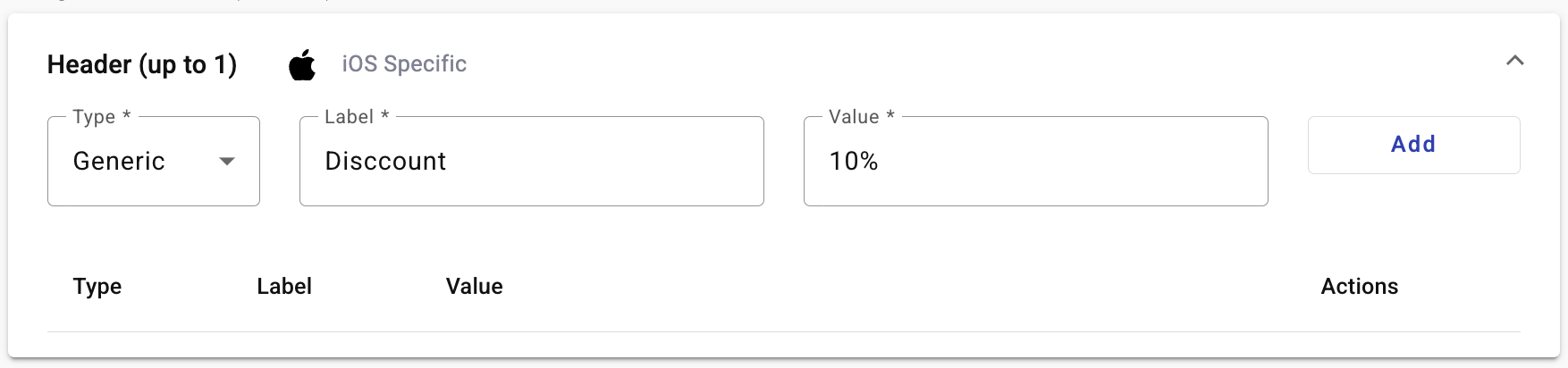
Header
The Header is an iOS-specific element of the card setup. It refers to the content that appears in the top right corner of the iOS version of the card. It contains highly relevant information as it is the visible component of the card pass when it is stacked up in the iOS wallet app.

-
Field Type: Member Cards let you display personalized and variable fields for each user. Field values are Generic or Unique, depending on the pass style.
- Generic: The value of the Generic Fields is static for all users.
- Unique: Fields are personalized for each member card generated, displaying variable fields for each user.
-
Label: A short text descriptor (e.g., "Discount"). This variable identifies an item in the card.
-
Value: Some elements in the Member Card Message Template have the option for a Generic Value for all cards delivered or a Unique Value per card, where the value is extracted from a Subscription List used at the time of Delivery. If you select the Generic Field Type, you specify its value. If you select the Unique Field Type, the value is extracted from a Subscription List.
Main Fields
You use Main Fields to offer the details of the member card promotion. You configure up to three Fields for the Card presentation to cover all the promotional information.
For iOS, the Main Fields are located under the Strip Image. For the Google Pay Pass, the Main Fields are found by scrolling down on the phone screen.
You configure the Main Fields the same way as the iOS Header, with the same elements and characteristics. The Type is Generic or Unique, Label identifies the Card items, and Value shares the same properties as the iOS Header. Below is an example of a fully defined Main Fields section.

Once you define a member card field, you edit or delete it under Actions.
Backside Fields
Backside Fields address the reverse side of the Member Card for iOS. For Android, they continue populating the card further down. You configure up to 5 fields.

You configure each Field using the same approach as above: Type, Label, and Value. The Generic Type Value data format is restricted to the format option you select in the Format entry box.

The data entered in the Value box must conform to the selected Format. These are formatting options only and are not confused with Contact platform Fields. You see an example of a fully populated Backside Fields section in the image below.
Locations
You use this feature to enable location-based notifications, allowing users to receive alerts when they are near a store. To learn how to configure it, go to Mobile Wallet Elements.
Interactions
In this step, you define member card expiration and redemption settings:

NOTEIf you didn't select a barcode in the Details section, you wouldn't be able to choose the barcode value or redemption type.
You configure the Pass Interactions using the following steps:
- In the Coupon Expiration section, set the validity of the Member Card by selecting the calendar icon in the Expiration Date field. You see a calendar where you set the date of the Member Card.

Once the defined date passes, the pass becomes invalid. The Barcode inside the Pass is blurred and labeled "This pass is no longer valid."
NOTEThe expiration date does not mean the member card is deleted.
The pass remains saved inside the user's Mobile Wallet because only the end user is allowed to delete cards from their Wallet Application.
-
In the Barcode redemption section, select the Generate Unique Codes option from the dropdown to generate the Barcode Value for each member card.
-
In the Barcode redemption section, select the Check-in option from the Redemption type dropdown to update the member card pass once the user has scanned the QR code.
When the user scans the QR code, they are redirected to a redemption website. The QR code is marked as already enabled, then the member card is updated on the user's phone. The user is then able to scan the QR code again.
NOTEThese codes are not redeemed only once as in digital member card but are "check in" codes. That is, these codes can be scanned one or more times until the pass expires. This code helps to accumulate visits.
For example, when the end user goes to the store to claim the member card, the worker scans the barcode and redirects them to the Redemption Manager page to scan the barcode.
The worker enters their credentials (username/password) and scans the code by selecting the Scan button.

Immediately after the code is scanned, the status changes to ENABLED.

If the status is DISABLED, the code has expired, been copied, or been scanned by someone other than the business that initially scanned it.

- Select Next to continue with the configuration.
Message
You create the message that delivers the member card to the recipients.

For more information about the message's Content and personalized fields configuration, go to the Message Content and Message Personalization section.
After you address all the message details, you select Next to move on to Summary.
Summary
You see the configured Automation Details and set the desired activation time in the Summary step.
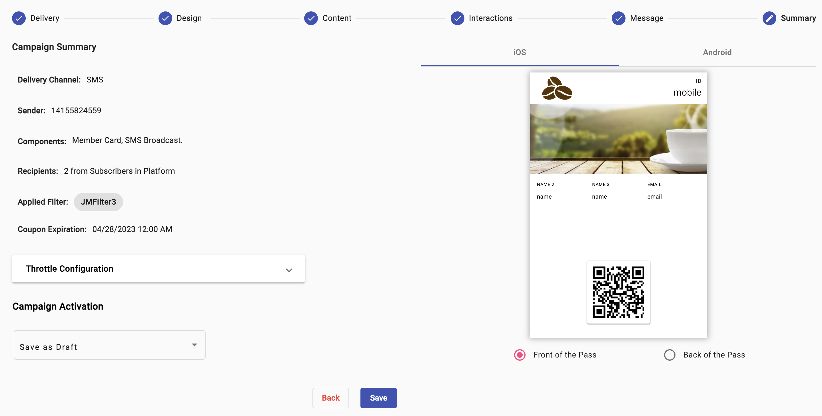
You see the following elements in the summary step:
-
Delivery Channel: Type of channel (SMS, Email) through which the automation was sent.
-
Sender: The sender type selected during automation setup is used as the sender of the notification message.
Remember, each delivery channel has its own sender type.
-
Components: Type of components of which the automation is composed: Automation type and Delivery Channel.
-
Recipients: Number of Recipients who receive the card.
-
Applied Filter: Filter type applied.
-
Card Expiration: Configured date on which the card expires.
-
Throttle Configuration: Set through the slider, the rate at which the messages are sent.
-
Campaign Activation: Set the automation delivery date (Now, Schedule, Save As Draft).
For more information about the Summary step settings, go to Summary in the Messaging Elements section.
Updated 9 days ago