Member Card Message Template
Configure digital membership or loyalty card templates for iOS and Android wallet passes.
Preconfigure the design and behavior of digital membership or loyalty cards for use in automations with the Member Card Message Template. Defining key visual and functional elements in advance ensures brand consistency and a better user experience across devices.

The message template is optimized for both iOS and Android (Google Wallet) environments. It includes a responsive preview panel that displays your changes in real time.

NOTESome fields and visual elements behave differently or are exclusive to specific platforms (iOS or Android). Make sure to preview your design for both platforms as you configure it.
You configure the Member Card fields from top to bottom in the main pane:
- Issuer Name: Name of the organization offering promotions, special offers, or discounts. It appears in the lock screen notification and at the top of the Google Pay Pass.
- Program Name: Enter the Title of the membership program you are creating.
Additional configuration sections cover: Design, Header, Main Fields, Backside Fields, Locations, and Ibeacons.
Design
In this step, you customize the message template by choosing your brand's colors and fonts and adding your logo, icon, and Strip image.

The overall design has three main components:
- Pass Design: Upload images for Logo, Notification Icon, Strip Image, and Hero Image (optional).
- Colors: Set background, label, and value colors.
- Barcode: Select a barcode format (QR, Aztec, PDF-417, or Code128) or disable it.
Pass Design
In the Pass Design step, you upload images that represent your brand's visual appearance. This step ensures the member card aligns with your branding and provides a professional look. You add up to four different images, each with a specific function:

| Image | Details |
|---|---|
| Logo | In iOS, the logo image is displayed in the top left corner of the pass, next to the logo text. Dimensions: 480 pixels wide x 150 pixels high. In Android, it is displayed in the top middle of the pass. Dimensions: The minimum size of the logo on the Google Pay pass is 660 x 660 pixels. |
| Notification icon | The icon image is shown when a Push Notification is received from the Wallet Pass in the user's lock screen. Dimensions: 87 pixels wide x 87 pixels high. |
| Strip Image | The strip image is displayed beneath the logo. Dimensions: 1125 pixels wide by 432 pixels high. |
| Hero | The hero image is used only on Google Pay passes. Dimensions: 1032 pixels wide by 336 pixels high. |
You click the Generate Google Pay Pass toggle to enable Google Pay Pass.

If you do not want to generate an Android member card, you disable the toggle. The Hero Image for Android becomes unavailable. The Android tab in Mobile Member Card Composer disappears.
If you want to display a strip image below the logo, you toggle the Strip Image option on.

NOTEIf you don't add the Hero Image into the Member Card, the Strip Image is added by default.
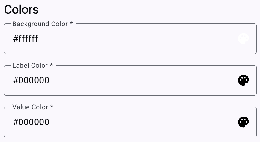
Colors
The Colors step defines the visual theme of your member card by setting colors for different elements. You use a color picker to match your brand's theme.
Barcode
The Barcode step enables automatic barcode generation. Users redeem their member cards by scanning a machine-readable code. If someone scans the barcode with a mobile device's code reader, they are redirected to promotional information designated by the creator.

The Barcode Type dropdown menu shows four options for the member card:

QR

Aztec

PDF-417

Code128
The member card will not include a barcode if you select 'none' in the dropdown.
The Mobile Wallet Pass Composer shows the Wallet Pass content for iOS, Android, and Notification views. It shows how your users receive notifications and Member Cards.

Header
The Header is an iOS-specific element that appears in the top right corner of the iOS card. It shows the most visible component of the card when stacked in the iOS wallet app.

- Field Type — Member Cards display personalized and variable fields for each user. Field values can be Generic or unique, depending on the pass style.
- Generic: The value of Generic Fields is static for all users.
- Unique: Fields are personalized for each member card generated.
- Label: A short text descriptor (e.g., "Discount") that identifies an item in the card.
- Value — Some elements accept a Generic Value for all cards or a Unique Value per card. Generic values are static. Unique values are extracted from a Subscription List at delivery.
Main Fields
Main Fields display the member card promotion details. It also addresses iOS and Google Pay Passes to best adapt to each card configuration. You configure up to three fields for the card presentation.
On iOS, the Main Fields appear under the Strip Image. On Google Pay Pass, you scroll down to find them.
Main Fields configuration follows the same approach as the iOS Header, with the same elements and constraints.

After you define a member card field, you edit or delete it under Actions.
Backside Fields
Backside Fields address the reverse side of the Member Card on iOS. On Android, they continue populating the card further down. You configure up to 5 fields.

Each field uses the same Type, Label, and Value approach as above. The Generic Type Value is restricted to the format you select in the Format entry box.

The data entered in the Value box must conform to the Format selected from the options shown. These are formatting options only and are separate from Contact platform Fields. The image below shows a fully populated Backside Fields section.
Locations (iOS Only)
This feature enables location-based notifications. Users receive alerts when they are near a store. Mobile Wallet Elements covers location configuration.
IBeacons (iOS Only)
Mobile Apps use this Apple technology standard to listen for beacon signals and react accordingly. Mobile Apps determine their position on a micro-local scale and deliver location-based content using Bluetooth Low Energy technology. IBeacons covers iBeacon configuration.
Final Steps
Once all configurations are complete:
- Categories (Optional) — You organize your message template by assigning it to a category using the Categories dropdown. This makes message templates easier to find later.
- Click Save.
- The message template will be added to the Member Card message templates type in your Message Templates dashboard.
You use this message template when creating new automations involving digital membership cards. Deployment across devices is faster and more consistent.